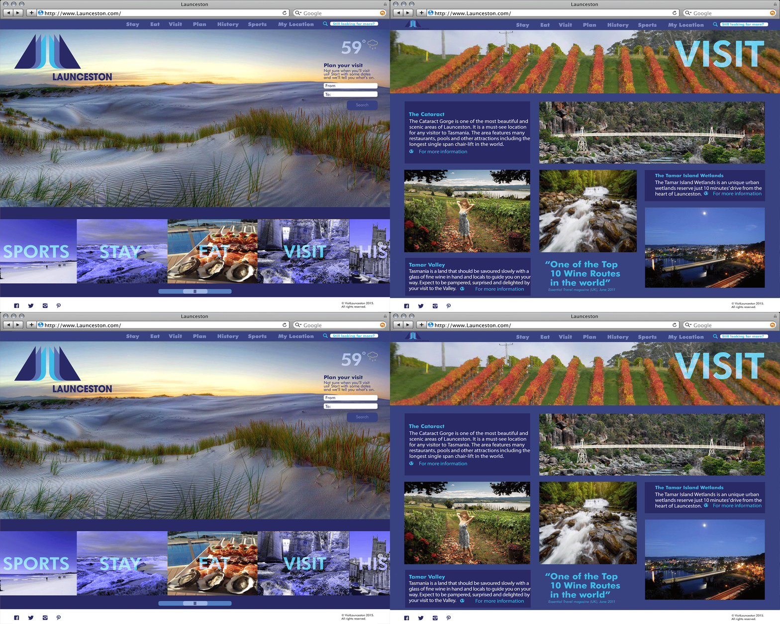
Identity Design: logo, wayfinding, and web
Launceston is an under-appreciated city in the northern part of Tasmania. It rests in the Tamar valley where three rivers (the north and south Esk join the Tamar) become one to continue their way through Tasmania. Surrounded with Victorian architecture, the city's diverse and welcoming people wait to meet visitors. As an adventure and culinary destination it compares to Tasmania's most popular city, Hobart. The brief called for a solution that combined the natural features of the city, as well as leading tourists who were tempted to head South to Hobart to come north.
While playing on this feeling of the three rivers becoming one, the logo subtly builds the shape of the Tasmanian "T" and points viewers north to the heart of Launceston. In addition the slogan "Beauty Points North" is a play on words as there is a small town just outside of Launceston called Beauty Point.


